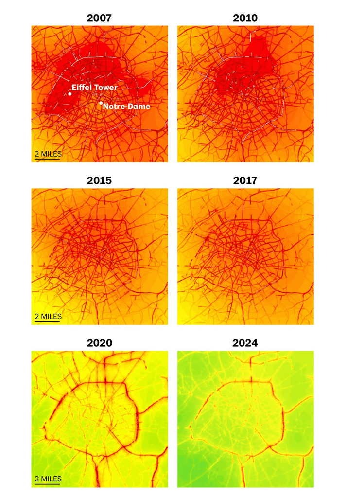
Pollution levels in Paris after they introduced bike lanes and car restrictions
Red = EU limits for Nitrogen Dioxide pollution
Original graphics by Atelier Parisien d'Urbanisme
https://www.apur.org

okay… when did they introduce those?
I thought those large scale switch to more bike lanes was since October 2021 with " Le Plan vélo de Paris"?
So then most of the visible change in that image happened BEFORE that date?
I'm all for more bikes and less cars… but that image doesn't look like useful data to support that cause?
I thought those large scale switch to more bike lanes was since October 2021 with " Le Plan vélo de Paris"?
So then most of the visible change in that image happened BEFORE that date?
I'm all for more bikes and less cars… but that image doesn't look like useful data to support that cause?
2020: Covid-19
and average and catalytic converters are way better in 2020 than in 2007
nitrogen dioxide may have decreased more due to that.
now if we were looking at fine particulates or other problems that are still a big problem as before per car? That might look entirely different.
All I'm saying is: that image isn't showing much and maybe even the opposite of what was intended.
- replies
- 0
- announces
- 0
- likes
- 0
